Date Picker
The Date Picker is implemented by using an input field, which includes a text field and a calendar icon that triggers a pop-up calendar.
Rules of Thumb
- Use the Date Picker when a calendar view is helpful for selecting a date.
- Do not use the Date Picker for dates easily remembered, such as birthdays; use a simple input field instead for faster input.
- The Date Picker should display the current month and year when activated; however, if a value has already been added to the input field, then the Date Picker will display the full date entered, including month, year, and day.
- Use an identifier to specifically highlight the current day to give context cues to users.
- Use an “Apply” action button to finalize selection if there are greater consequences for entering the wrong date.
Appearance and Behavior
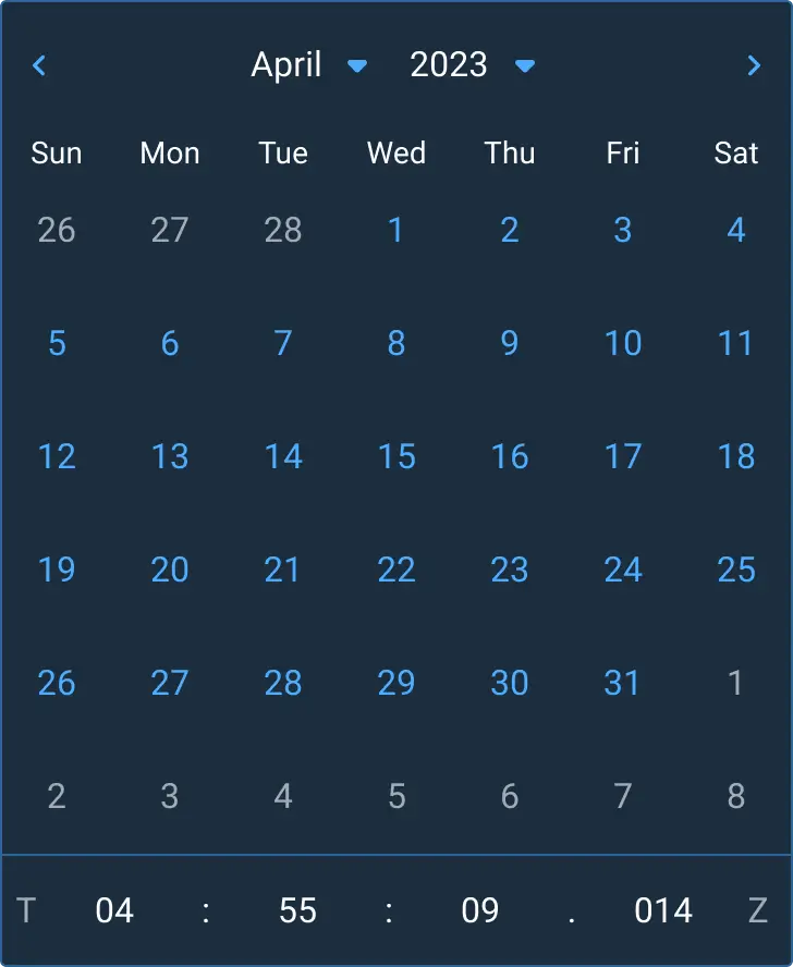
The Date Picker header contains both a month and a year dropdown. It also contains navigational arrows on either side to select a previous month (left arrow) or a future month (right arrow).
The calendar header displays a shortened version of the days of the week, starting with “Sun” for Sunday and ending with “Sat” for Saturday. Astro chose this format because it is the most widely used pattern for calendars.
The calendar body displays the dates of the selected month and year, with the ability to select any day of any month. Days from other months are presented in a different styling so that the users are aware that these days are outside of the current month being viewed. Despite this styling difference, days from other months can be selected while viewing the current month.
When present, the Date Picker footer contains two actionable items: an Apply button, which applies the selected date to the input field, and a Cancel button, which closes the Date Picker and returns focus to the date input field. While it is possible for a date selection to close the Date Picker and add the selected date to the input field, Astro recommends adding the Apply button to prevent the users from having to open and close the Date Picker multiple times to fix any mistakes and for clearer action states for accessibility. In addition, the users could click outside of the Date Picker to cancel selections and return the input field to its previous state. This set of buttons is intended to be a future improvement to Astro’s current Date Picker component.
Calendar Day Tile States
- Default: Date numbers are styled as interactive elements.
- Hover: The background color of the day swatch changes.
- Focus: When tabbing through items, the color swatch displays an additional border to show the focus state of an item.
- Selected: When a day is selected, the background color of the day swatch changes and a new border is set.
- Previous or Future Day: Days from previous or future months will appear in the currently displayed month when they fall within the selected date range. These days are set to a different color so the users can differentiate them from the days of the currently displayed month.
- Disabled: Days that are not selectable are shown with a lower opacity.
Date Format
Astro provides three date format options for the Date Picker: Gregorian, Julian, and a combined view displaying both date formats simultaneously.
Default Calendar Format (Gregorian)
The Gregorian calendar is the default format used by Astro. It comprises 12 months, each with 28-31 days, and is formatted as YYYY-MM-DD in the date input. For example, March 7, 2023, is displayed as 2023-03-07.
Julian Calendar Format
The Julian calendar format displays the day as an ordinal date, which is a consecutive count of days within a year, ranging from 001 to 365 (or 366 for leap years). It is formatted as YYYY-DDD in the date input. For example, March 7, 2023, is displayed as 2023-065 since March 7 is the 65th day of that year. Note that this type of date format is formally known as an Ordinal Date, but many military users know it as Julian date, so we have titled it to match their common usage.
Combined Format
The combined format displays the Gregorian format (in two digits) in the upper left corner of the day swatch. This is followed by the Julian date (in three digits) in the lower right corner of the day swatch. This allows for quick conversion between the two formats. This format is currently available in design but is not yet present in the coded implementation.
Time Picker
The Time Picker is nested in the bottom of the Date Picker component. It allows users to input a specific time, either manually or through incremental controls (i.e up/down arrows). Currently, Time Picker only works in tandem with Date Picker and should only be used in that context.
Rules of Thumb
- Do use Time Picker when precise time input is required — especially for scheduling, telemetry, or mission critical events.
- Do not use the Time Picker for general-purpose tasks where time granularity is not meaningful (e.g casual notes).
- Follow ISO 8601 time formatting when displaying or storing time for clearer communication. This is built into Astro’s Time Picker designs and coded component.
- Provide clear visual feedback of field state on time fields, such as focus and hover.
- The 24-hour format works best for clear time frames and is expected in most space and military situations. We recommend avoiding using AM/PM as a sole time format option.
- Ensure keyboard accessibility and screen reader support for both manual and incremental controls.
Appearance and Behavior
- Default State: The Time Picker displays hour, minute, and millisecond support for granular use cases.
- Hover State: The Time Tile border becomes visible when hovered.
- Focus State: A secondary visual indicator is used to denote input focus.
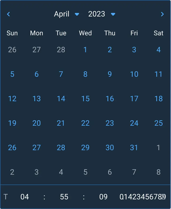
- Scroll/Number Input Arrows: Up and down arrows in the Number Input for each Time Tile allows the user to increment or decrement values easily.
- Responsive Behavior: Time Tiles adjust width dynamically to accommodate various digit lengths up to microseconds (Thh :ss.ssssss).
Date and Time Picker Integration
When used with the Date Picker, the Time Picker should appear in a logical position beneath the calendar grid. If “Apply” and “Cancel” buttons are desired, they would appear in a footer below the Time Picker in the Date Time Picker component combination.
Time Format
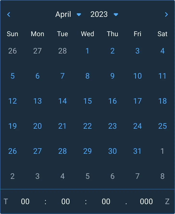
- Default: 24-hour time format (Thh :ss.ssssss)
- Format Guidance: Aligns with ISO 8601 including the T separator embedded in a full date-time string before the time section and the UTC offset indicator (e.g. Z) at the end of the string. In this case, Z stands for Zero Offset from Coordinated Universal Time. Z is frequently referred to as Zulu time in aviation and military contexts.
Examples
Asset Status
| Asset | Version | Status |
|---|---|---|
| Documentation | N/A | Available |
| UI Kit - Dark | v7 | Available |
| UI Kit - Light | v7 | Available |
| UI Kit - Wireframe | v7 | Available |
| Web Component | N/A | Not Available |
| Component Tokens | N/A | Not Available |